Trout Lake Little League
Identity Design (Concept Work)
OVERVIEW
Trout Lake Little League is a place for kids in East Vancouver to learn and play baseball. Our goal was to redesign their identity and at least 3 assets for the organization. Our primary audience was young kids and families in East Van. Our secondary audience was current and potential volunteers for the organization.
PROCESS
ROLE
Branding
Web Design
TOOLS
Illustrator
Figma
TEAM
Claire Patten
Thu Nguyen
DURATION
6 weeks


OVERVIEW
Trout Lake Little League is a place for kids in East Vancouver to learn and play baseball. Our goal was to redesign their identity and at least 3 assets for the organization. Our primary audience was young kids and families in East Van. Our secondary audience was current and potential volunteers for the organization.
RESEARCH
My research included taking field observations at Trout Lake and East Van and researching the visual identities of other baseball teams. My teammates looked at historical archives, critiqued the team's current identity, and created stakeholder profiles. We found MiLB logos to be a good source of inspiration as their mascot-focused identities would be suitable for a kids team. We decided to lean on the expressive culture of East Vancouver as our main visual inspiration.

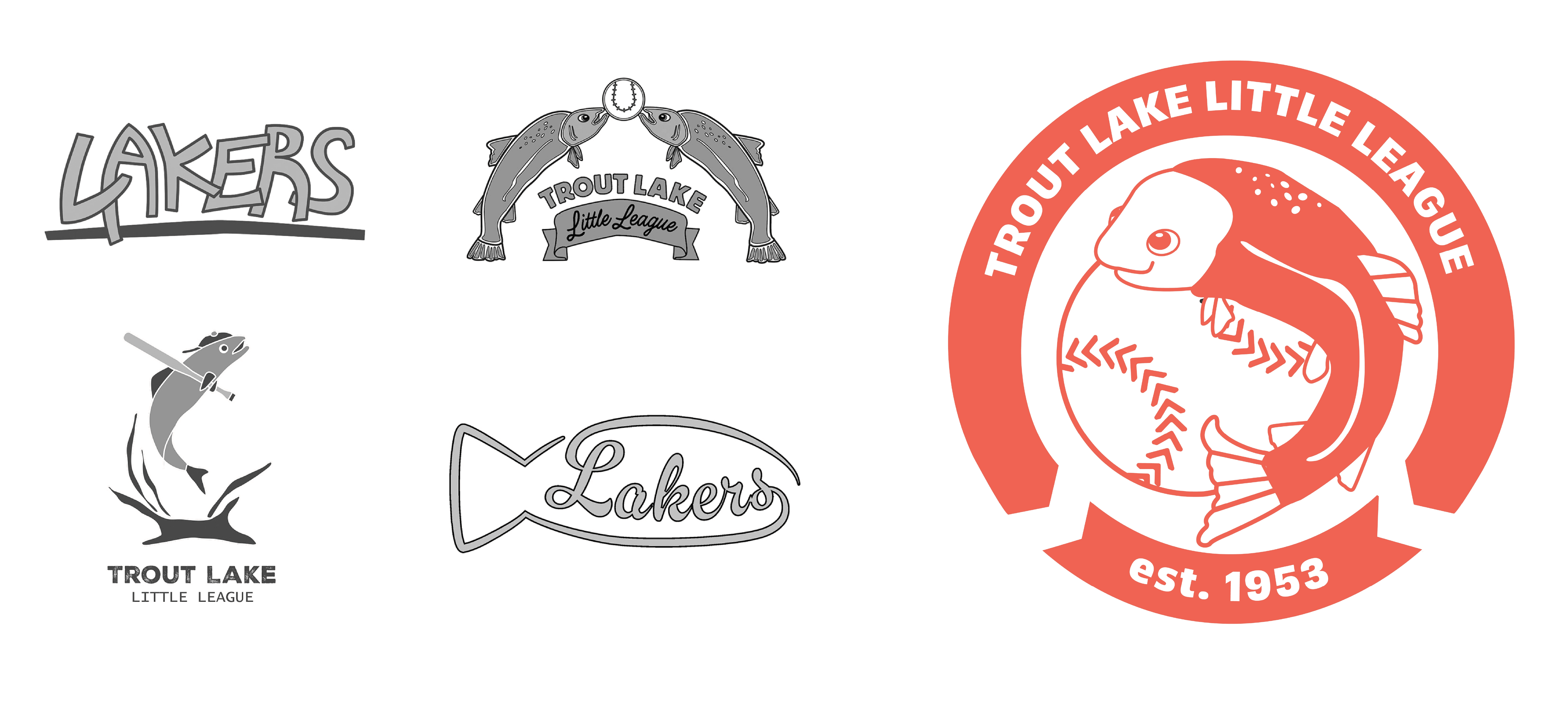
LOGO
Collectively, we created 100 draft logos. Our chosen logo reflects the friendly nature of the league, and combines a modern design with a traditional banner outline. Once we had a logo, we began to develop deliverables. The first ones we developed were a fence banner, website, and Instagram posts. I focused on the website.
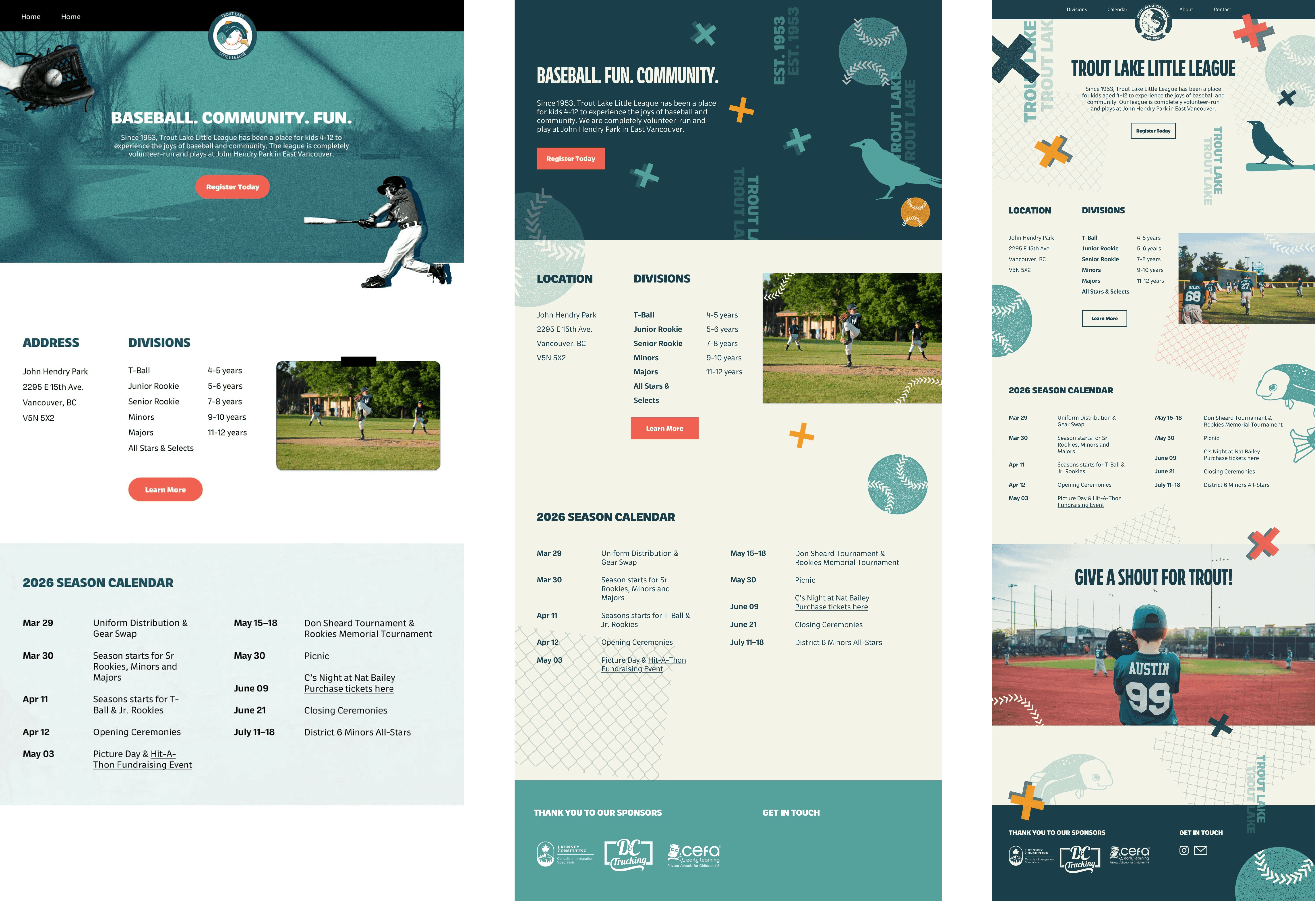
WEBSITE ITERATION
The website was originally photo-heavy and divided by colour blocks. I was encouraged to lean more towards graphic illustrations and use less clear divisions on the website to make it feel contemporary. For all the final assets for this project, we referenced the collage style of Jimmy Turrell, which we thought was a good match to emphasize the artistic culture of East Van.
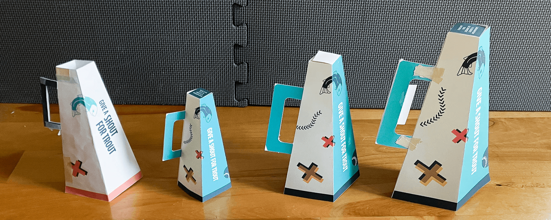
POPCORN HOLDER
Baseball stadiums used to sell popcorn in cardboard containers which could be transformed into megaphones. I thought it would be a suitable promotional item for young kids watching a sibling playing. It was also an opportunity to showcase the team slogan I developed– "Give a shout for Trout!" I created a template and experimented with scale, taking into account how comfortable it'd be to hold and its popcorn-holding capacity.
REFLECTION
This project emphasized to me the value of doing field research. When I had only referenced Google Maps and online resources, I had difficulty figuring out visuals that felt reflective of East Van. However, after walking around the neighbourhood, I realized East Van is made up of many different types of people and perspectives. I realized I had been trying to pigeonhole the neighbourhood into a specific aesthetic. When we presented our deliverables in class, we received enthusiasm about the slogan and how we leaned into East Van rather than traditional baseball motifs.

RESEARCH
My research included taking field observations at Trout Lake and East Van and researching the visual identities of other baseball teams. My teammates looked at historical archives, critiqued the team's current identity, and created stakeholder profiles. We found MiLB logos to be a good source of inspiration as their mascot-focused identities would be suitable for a kids team. We decided to lean on the expressive culture of East Vancouver as our main visual inspiration.
LOGO
Collectively, we created 100 draft logos. Our chosen logo reflects the friendly nature of the league, and combines a modern design with a traditional banner outline. Once we had a logo, we began to develop deliverables. The first ones we developed were a fence banner, website, and Instagram posts. I focused on the website.
WEBSITE ITERATION
The website was originally photo-heavy and divided by colour blocks. I was encouraged to lean more towards graphic illustrations and use less clear divisions on the website to make it feel contemporary. For all the final assets for this project, we referenced the collage style of Jimmy Turrell, which we thought was a good match to emphasize the artistic culture of East Van.
POPCORN HOLDER
Baseball stadiums used to sell popcorn in cardboard containers which could be transformed into megaphones. I thought it would be a suitable promotional item for young kids watching a sibling playing. It was also an opportunity to showcase the team slogan I developed– "Give a shout for Trout!" I created a template and experimented with scale, taking into account how comfortable it'd be to hold and its popcorn-holding capacity.
REFLECTION
This project emphasized to me the value of doing field research. When I had only referenced Google Maps and online resources, I had difficulty figuring out visuals that felt reflective of East Van. However, after walking around the neighbourhood, I realized East Van is made up of many different types of people and perspectives. I realized I had been trying to pigeonhole the neighbourhood into a specific aesthetic. When we presented our deliverables in class, we received enthusiasm about the slogan and how we leaned into East Van rather than traditional baseball motifs.